Many flags around the world are iconic, think the ones of France, Canada, South Africa, the Nordics, etc.
However, there are some that aren’t as good, like the Australian and New Zealand flags, both of which still retain the union jack with little Indigenous symbolism. Speaking as an Australian myself, our flag isn’t all that great! The Southern Cross is cool, but there is no hint of green/gold, and the union jack just looks tacked on. There are also many flags that look good, but the symbolism represents ideas that you’re against. Think Iran’s flag that draws heavily from their sect of Islam and the theocracy, or the PRC’s flag having the smaller stars representing the people surrounding the larger star representing the one party state. There’s also some that are okay, but a bit boring and hard of distinguish from the rest, and an additional element would make it stand out more.
And purple should be on more flags! Republican Spain during the 1930s had some purple, but they lost the civil war and the flag was replaced.
If you could change the national flags of the world, what would be your flag proposals?
You must log in or register to comment.
There’s a lot of flags that annoy me and I would like to see changed, but I think these are the ones that I would change without a second thought:
Russia
Current: I find their current flag to be offensive to the eyes. The bright blue and red clash with each other, and the white bar at the top makes it looks like it's upside down. It gives off a very uncomfortable and depressing vibe.

Suggestion: I would change it to the old black, yellow, and white flag that Imperial Russia used. I think it's a very beautiful and elegant flag with a unique color combination that harmonizes well together.

Iran
Current: It takes the classical Iranian tricolors and gives them these disgusting squiggles to the green and red blocks that are supposed to be "Allahu Akbar" on repeat in the Kufic script. They also add this eyesore of an islamic emblem in the middle that supposed to be a bunch of swords and a crescent spelling out "allah" in Arabic. I don't know a single Iranian who likes this flag.

Suggestion: I would change it to the old lion and sun flag. Not only does it look badass, but this flag actually carries the history of Iran. It's the historical flag, it's the flag that people identify with, and it's a flag that encompasses all Iranians, not just the muslims (which are barely a majority in the country).

Iraq
Current: The flag of my home country is just stupid. It's a tricolor used by previous Iraqi flags with 3 stars in the middle. Saddam Hussein later added the words "Allahu Akbar" in Arabic between the stars. The new Iraqi government ran with it, but then later decided to remove the Saddam Hussein elements by removing the stars he didn't add and keep the "Allahu Akbar that he did add". It pissed off a lot of people because it's a deceitful attempt by islamists to pretend that Iraq is an islamic state.
Suggestion: Go back to the Qasim flag. This was a flag that was used in Iraq after the revolution to overthrow the monarchy. It used the pan-arab tricolors to represent the Arabs, a yellow circle that represented the Kurdish sun, and a red star that symbolized the star of Ishtar which represented the Assyrians in the country and the country's rich history. It's simply a superior flag, though I would do away with the pan Arab colors in favor of something that symbolizes Iraq.

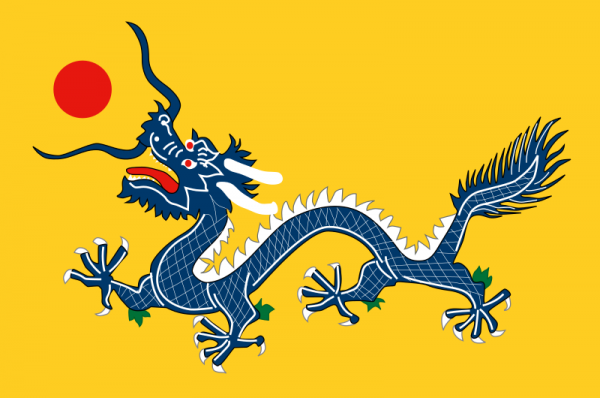
China
Current: I will forever hold the opinion that communist flags are hideous. China is an ancient civilization that has a rich history and culture, and you're telling that they can't find anything to symbolize their nation outside of a foreign influenced communist flag? Bullshit.

Suggestion: Bring back the Qing dynasty flag. It's iconic, it's indigenous, and it represents China's deep heritage way better than a bland red flag with stars. Besides, it has a cool dragon on it, how can anybody hate that?
Belarus
Current: Is this not one of the ugliest flags in the world? The colors clash with each other, the blocks are not balanced, and the pattern on the side is just repulsive. Not only that but this flag is a stripped down version of the Soviet Imposed flag, which most Belarussians view as a symbol of Russian imperialism. To make matters worse the current flag was designed and imposed by Lukashenko, the brutal dictator of Belarus, in 1995. Belarussians view this gross flag as symbol of Lukashenko's tyranny and an extension of Russia's imperialism.

Suggestion: It's time to replace the current atrocity with the real flag of Belarus. Belarus literally means 'White Rus' as in the historical term for the ancient Slavic Rus who were never conquered by the Tartars, and this flag has a lot of white to represent that freedom and red for the sacrificing that it took to defend it. I specifically like the variation that has the coat of arms of Lithuania on it since a good portion of the historical Polish-Lithuanian Commonwealth encompassed modern Belarus.

All of the flags that are just stripes. It’s too easy to get them mixed up with similar-looking striped flags, especially if there are others with the same colors. Obviously people from that country will know which flag they’re looking at, but people from other countries can easily get confused. It kind of detracts from the power of the flag if other people don’t know what it represents or have to search it up every time they see it.
Flags should be immediately distinctive and memorable, IMO. Like, I love how Canada’s flag has a Maple leaf. No one else has a maple leaf, so people can remember that one.
I feel like some tricolours should get a pass. France and the Netherlands are the OGs, but many others are great too! Estonia’s is my favourite colour combination, but Germany, Lithuania, Romania, and Bulgaria are pretty recognisable too. Sierra Leone and Gabon have pretty underrated tricolours too. There are some that are too similar to others, like those of Russia (very similar to the Dutch), Chad (nearly identical to Romania), and Italy (pretty close to France, in my opinion Mexico did the colour combo better with the cool eagle)
As for the bicolours, you have the triage of Poland, Monaco, and Indonesia who are really similar. Poland should add their eagle back to the flag, birds are cool and it’s deeply tied to their history, and Indonesia needs to spice their flag up to be more interesting. Monaco should probably be annexed into France, maybe they could be an autonomous province or something. Then you have Ukraine, who have a pretty neat flag that is easily recognisable, but yes it is a little boring.
Austria and Latvia are quite similar to each other too, the latter has a thinner strip that’s more unique, but I feel like both could be improved.
New idea for US flag!
That is the most hideous thing I’ve ever seen
great post
Let’s make a tierlist sbout how urgent it is for them to change:
S:
- Poland’s flag is supposedly derived from a white bird against a setting sun. To me it would make sense to include that imagery on the flag, or a historical coat of arms.
- I think places like Syria, Egypt, Libya, Iraq need to agree on a different colour scheme for themselves. At the moment they’re confusingly similar
- Russia’s current flsg i bslieve it’s literslly just copying the french and netherlands colours because Peter the Great was so inspired by them.
The old fashioned, imperial russian flag was beautiful:

But even better is with a crest:

Which can be simplified for a stylish modern design (as i bekieve all credts should be when possible)

Alternatively, a bear could look good on their flag:

A:
- Israel (changing flag after a hopeful regime change would be prudent because it’s like a symbol of genocide now.)
B:
- Luxembourg (too similar to Netherlands),
- China (i find china’s flag really dull even if it is iconic. They surely want to invoke their historical longevity rather than just Communism. Stars represent the key chinese regions, which seems like a good feature - the red does not.)
F:
- I don’t think i’d change it, but Canada seems as/more close to britain than Australia so it makes more sense to give a little Union Jack in the top left corner.
Petition for you to add flag emoji to each country mention, e.g. “🇵🇱 Poland”, for those of us (me!) who are vexillologically challenged and don’t remember any flags.
Edit: an attempt, based on gboard’s emoji search functionality and with zero verification:
great post
Let’s make a tierlist sbout how urgent it is for them to change:
S:
- 🇵🇱Poland’s flag is supposedly derived from a white bird against a setting sun. To me it would make sense to include that imagery on the flag, or a historical coat of arms.
- I think places like 🇸🇾Syria, 🇪🇬Egypt, 🇱🇾Libya, 🇮🇶Iraq need to agree on a different colour scheme for themselves. At the moment they’re confusingly similar
A:
- 🇮🇱Israel (changing flag after a hopeful regime change would be prudent because it’s like a symbol of genocide now.)
B:
- 🇱🇺Luxembourg (too similar to 🇳🇱Netherlands),
- 🇨🇳China (i find china’s flag really dull even if it is iconic. They surely want to invoke their historical longevity rather than just Communism. Stars represent the key chinese regions, which seems like a good feature - the red does not.)
F:
- I don’t think i’d change it, but 🇨🇦Canada seems as/more close to britain than 🇦🇺Australia so it makes more sense to give a little 🇬🇧Union Jack in the top left corner.
A correction on the PRC’s flag: the 4 smaller stars each represent one of the classes in New Democracy:
- The Proletariat
- The Peasantry
- The Petite Bourgeoisie
- The National Bourgeoisie
The fifth, largest star, is for the CPC itself, which unites and guides the 4 classes, itself dominated by the proletariat.
The old, five stripes flag is the one that represented the 5 major ethnic groups of China, which is often confused as the reasoning for China’s current 5 stars.